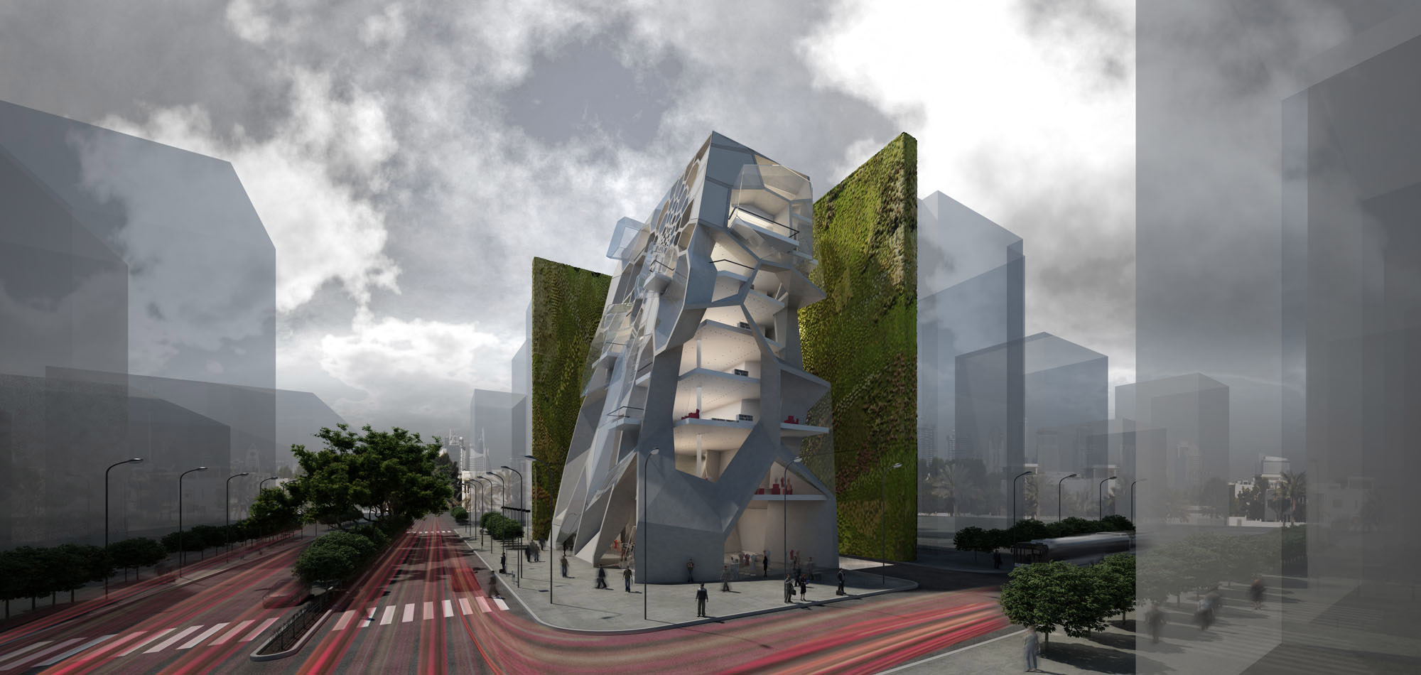
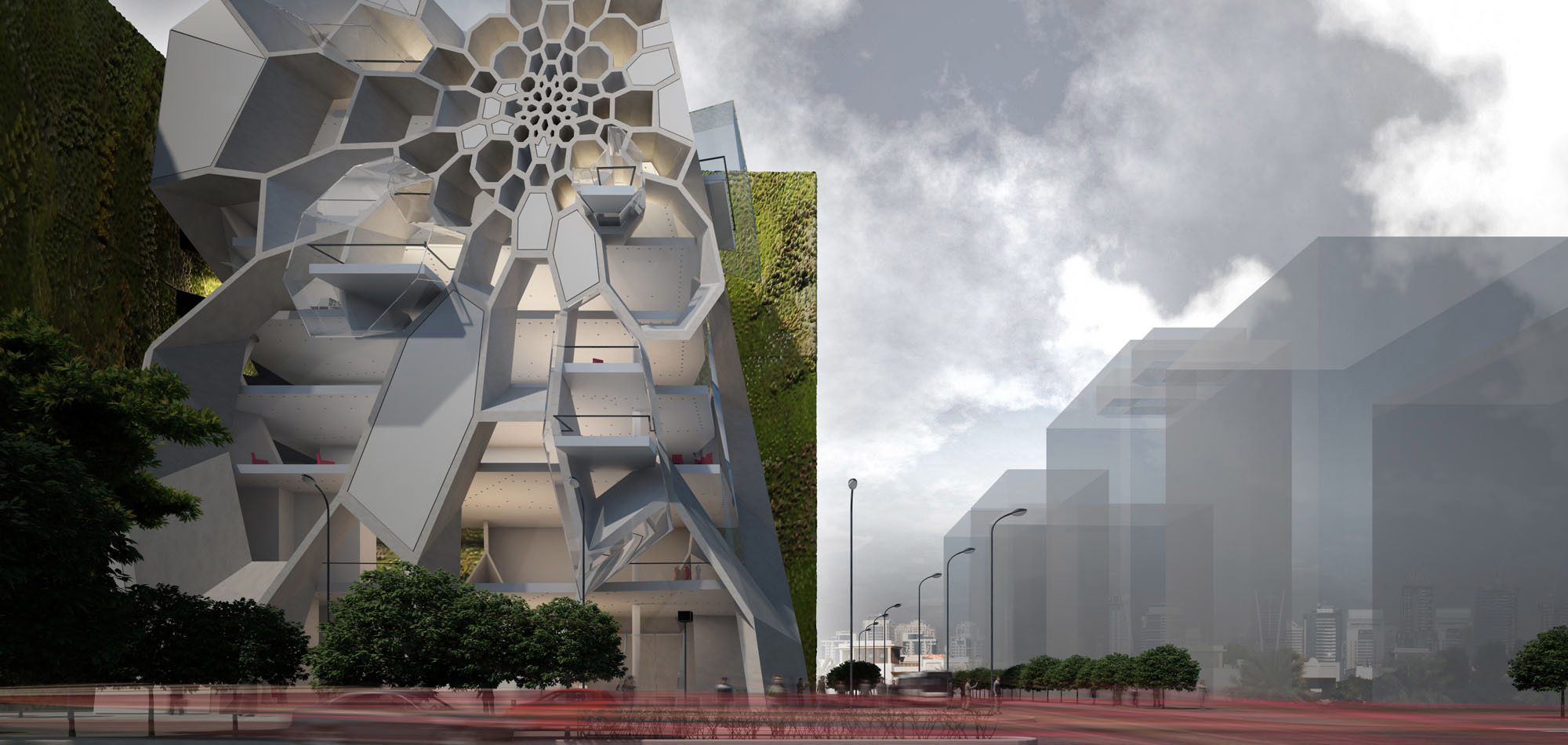
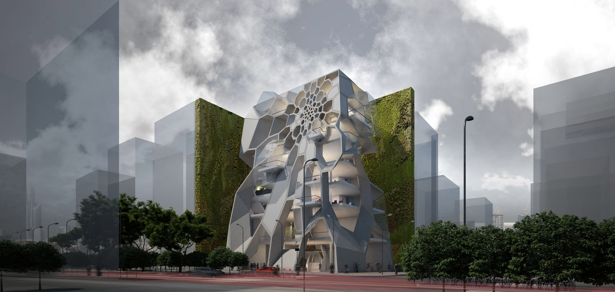
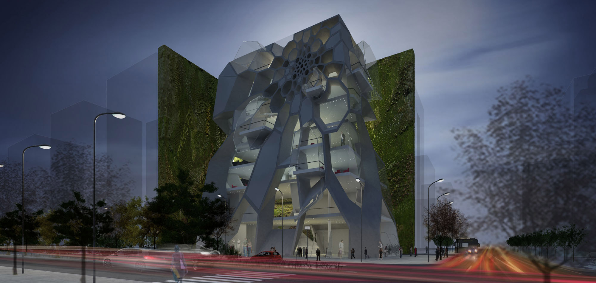
The proposal is for a multi storey building which comprises of offices and lofts and is located in the centre of Jordan’s capital. The design process began with the study of Amman’s urban environment, its organizational principles and the study of the typology of the structures located in the neighbouring area. This analysis and the study of Jordanian architecture, informed the volumetric investigation which started with a plain parallelepiped, parallel to the building plot’s shape and attached to the adjoining buildings. Consecutively, the lower edges are drawn towards the street grid, while the volume is detached from the inner boundaries of the site. The elaboration on the volume’s skin, as the final border with the city and the one that determinately conveys meanings and symbolisms to the contemporary city, is what will form the connection with the specific location. For this reason, various patterns observed in traditional Jordanian architecture were studied, along with the various methods of their scheme reproduction.
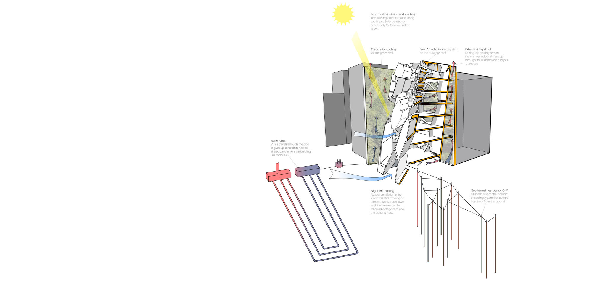
There is a Muslim belief that one can find geometry in the design of all life forms from animal and plant cells, plant forms, snow, and geological structures hence the expression “geometry is God manifest”. Islamic religious architectural design is based on ‘sacred’ geometry, consisting of, or generated from, such simple forms as the circle and the square. These geometric patterns were combined, duplicated, interlaced, and arranged in intricate combinations. There is an Islamic belief that studying the nature of these patterns, forms, relationships and their connections, insight may be gained into the mysteries – the laws and lore of the Universe. The pattern that was finally selected to be processed was eventually projected onto the primary volume’s faces, expressing the forces that act upon it. The primitive box, the one that will accommodate the building’s functions, is enclosed in this ‘veil, which also defines the extent of the city’s flow into the building, allowing a gradual interplay between indoors and outdoors, differing from floor to floor, in accordance to the needs of the equivalent level. The inner border, the back planes neighbouring with the adjacent building plots, is covered with a layer of low planting, responding to the green border encountered between the neighbouring building blocks. It is in this way that this relieving green breath creates a special environment for the building, forming the background of the architectural synthesis and cumulates towards its intended clearly recognizable identity.
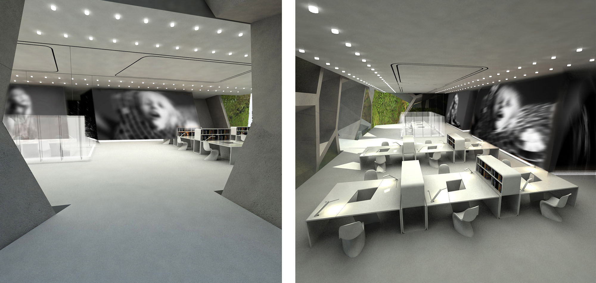
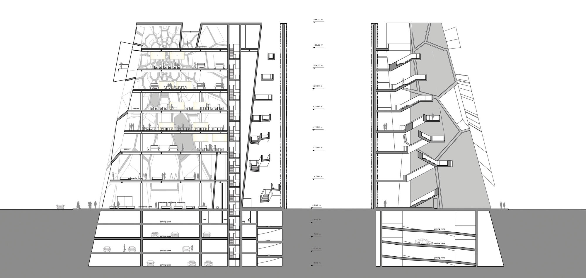
The main vertical and horizontal circulation to the upper floors (offices, apartments) is situated in the space created by the detachment of the building from its site’s boundaries. In this way the circulation is accomplished outside the main core of the building thus allowing the visitor entry through small openings, gradually revealing the interior spaces. The layering of the spaces follows the required sequence and reflects the gradual accession of the social privacy. The stores, as the most public part of the program, are situated on the ground and the first floor. The connection between the two floors is established through a single route beginning from the main entrance and resulting at the second floor, symbolizing the incoming of the city into the building. The organization of the commercial units mimics the structure of the traditional bazaar. We consider the bazaar as a paradigm structure of the merchandising local practice, which comprises a vibrant hub for social interaction. The core element of the bazaar, the spinal of its structure, the main route that fuels the stores, is interpreted here with this very path, with the commercial units being organized around it. As far as the offices are concerned, the main goal during the design was to achieve maximum organizational flexibility for the user. Considering a single desk as the primary unit, and a library stack as the secondary element that acts as a dividing boundary between two desks, various geometries were studied, resulting to various combinations of the congregation of the units. The benefit of this organizational method is that each working team will be free to customize the working space according to its number of members and their requirements. The top level of the building is purely residential in use and houses two spacious family lofts.

