The form itself is of very limited importance; it becomes the grammar for the total work. In fact, it is best that the basic unit be deliberately uninteresting so that it may more easily become an intrinsic part of the entire work. Using complex basic forms only disrupts the unity of the whole. Using a simple form repeatedly narrows the field of the work and concentrates the intensity to the arrangement of the form. This arrangement becomes the end while the form becomes the means. Compared to any other three dimensional form, the cube lacks any aggressive force, implies no motion, and is least emotive.
- Sol LeWitt
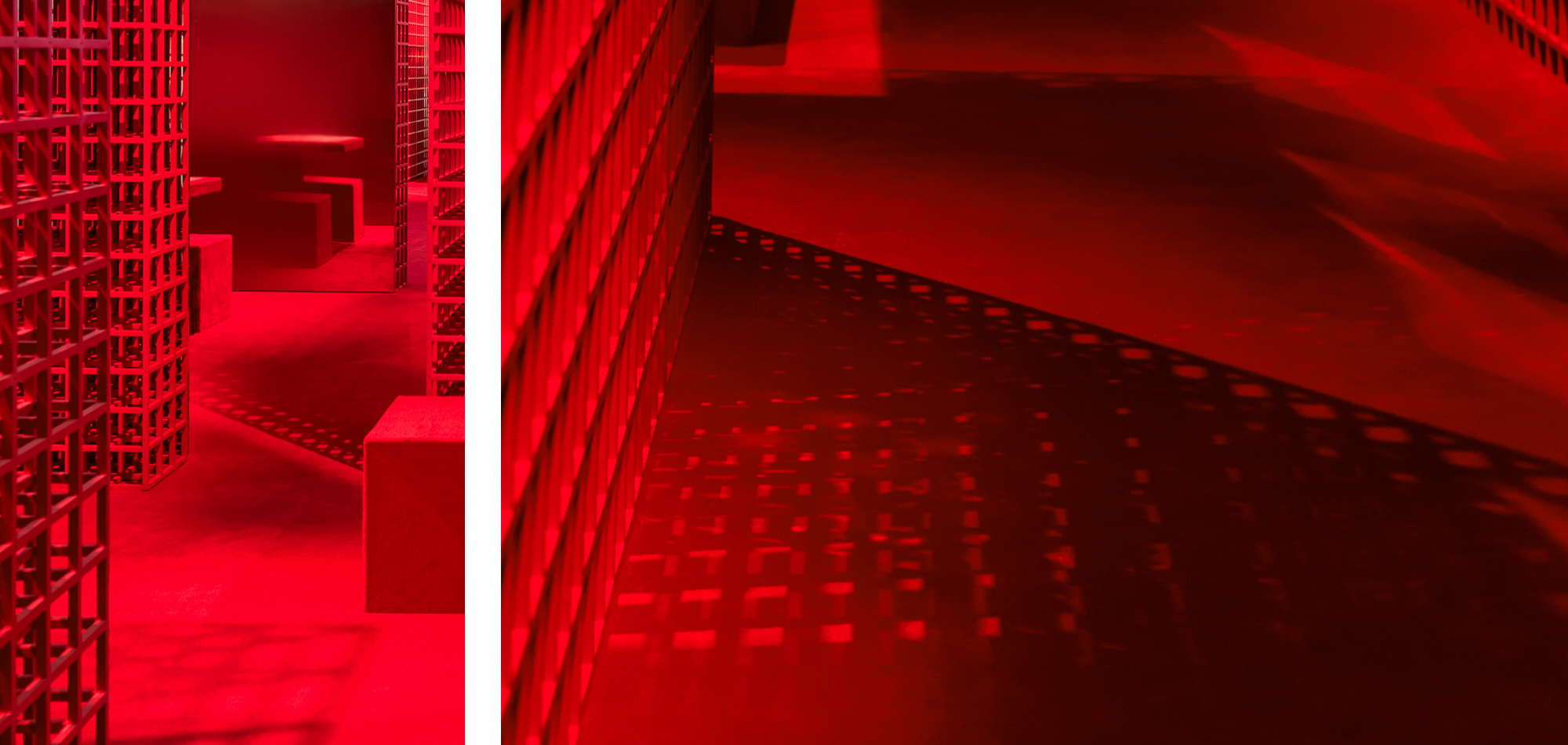
Because of the possibilities for multiplication inherent in the grid form, a basic and seemingly unlimited vocabulary was at our disposal. In addition to that, the usage of a system was able to display our vision with a rigorous language and simultaneously offer adaptability to the variations that needed to be accomplished on site. The premise governing this system is to place one form within another and include all major variations in two and three dimensions. This is to be done in the most succinct manner, using the fewest measurements. It would be a finite series using the square and cube as its syntax.
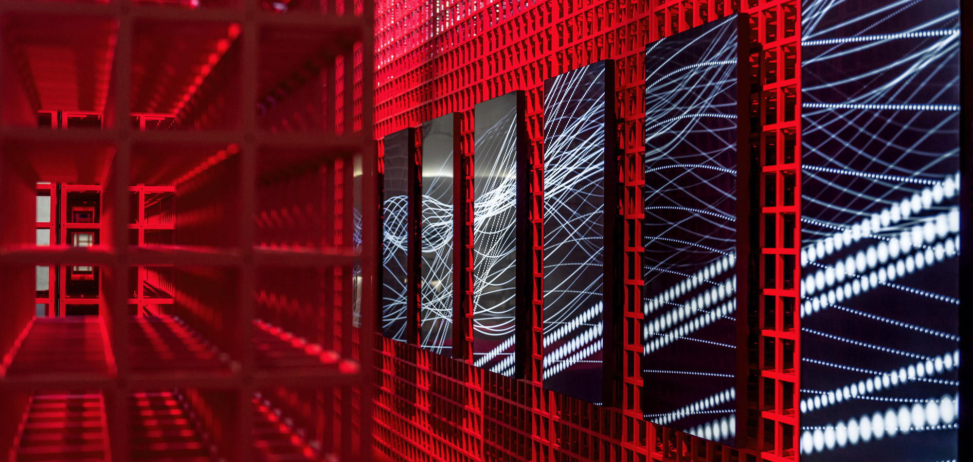
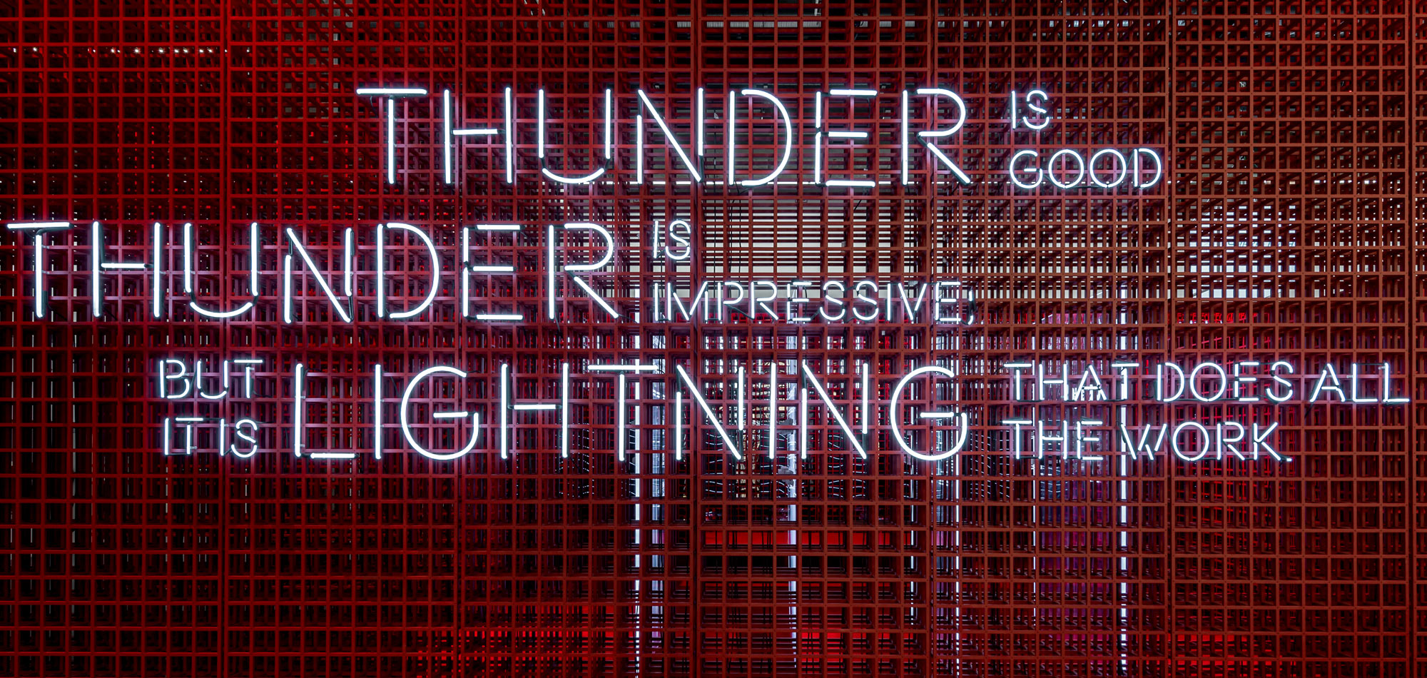
At the same time, systems of elementary shapes can proliferate with a crazy extravagance that, to our surprise, puts the rational gray matter of logic, at the service of a wildly florid imagination. It is as if the computer binary language and systems, that silently and invisibly permeate our every action, had been freed from their utilitarian duties and had gone berserk in new two- and three-dimensional, cellular or labyrinthine structures at once numbingly simple and bewilderingly complex. The bright monochromatic approach, the constant movement of the perspective through the three-dimensional grid, the reflecting metal panels that gradually fade into color, are chosen in order to create a sensory experience that reflects the company’s forward-looking ethos, an experience that is engaging and memorable.
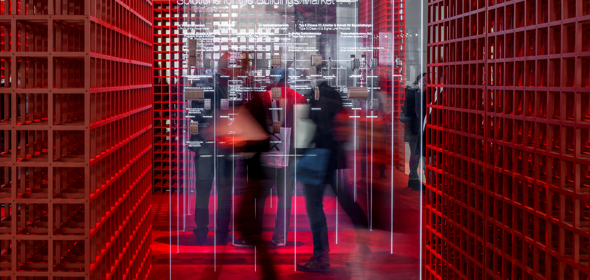
Occasioned by the three dimensional modular systems that LeWitt produced, which for one, reconcile two opposing modes of structure, the rigorous order of a simple repetitive system and the abdication of this elemental order in favor of the aleatory, we worked in collaboration with Bureau Mirko Borsche towards the composition of an engaging sensory space. This immersive pavilion would enable the visitor to penetrate a normative modular structure and contribute to the fluidity and the transparency of the space. What we tried to accomplish through this collaboration was for the antithetical systems of order and antiorder to be merged. Taking this into consideration, the ephemeral, organic forms that occupy the screens, as well as the transparency of the plexi-glass panels are wedded to the stable, tectonic look of the modular wall planes that comprise the space, so that the components of the architecture are dissolved into the illusory plane of the installation and vice versa.


