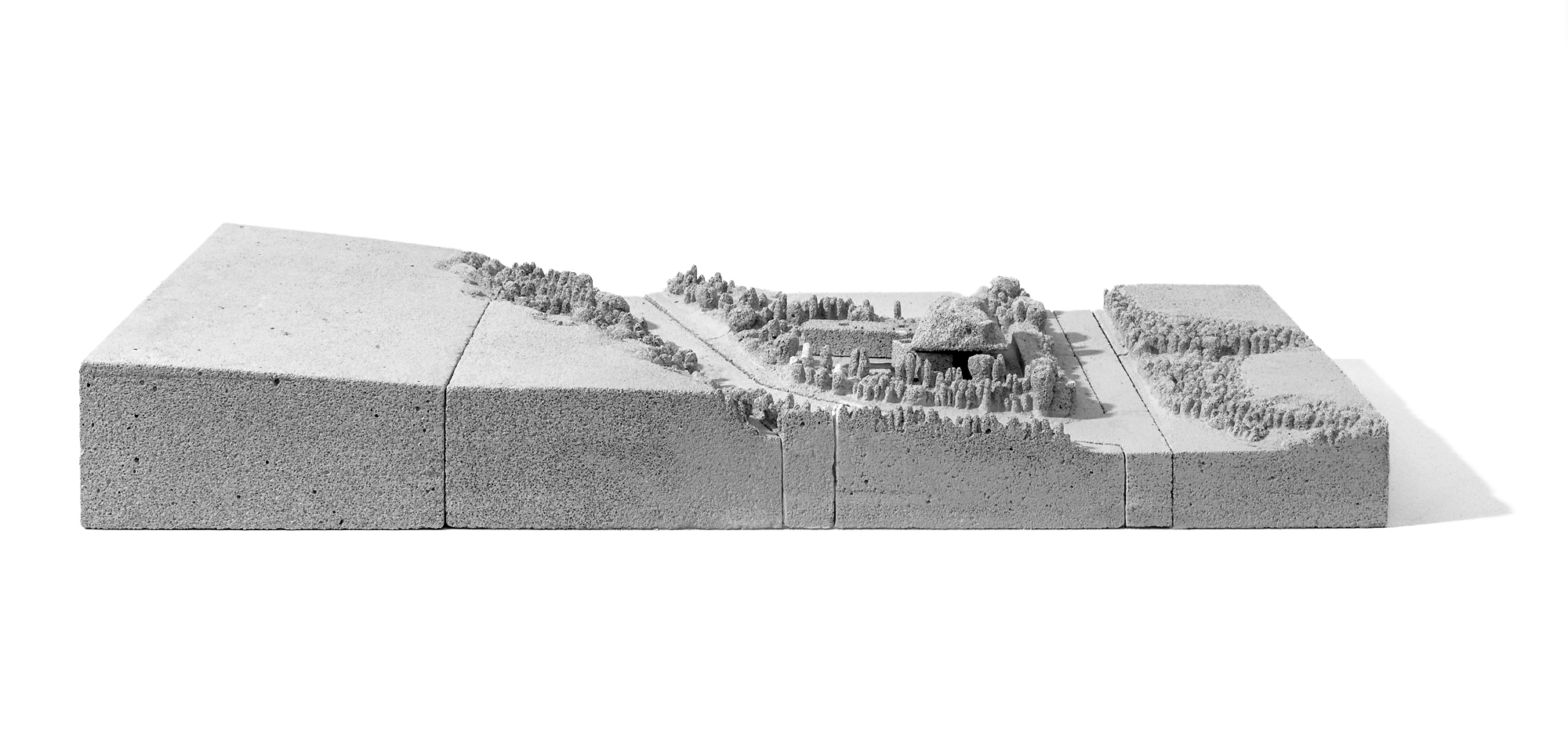
The project is a family summer residence situated in the south west Peloponnese region of Messenia, on an elevated site marked by steep and narrow slopes on the southern western and eastern boundary.
The main conceptual strategies of the house are the mimesis technique, which fuses the building with its surroundings and the cinematographic planning strategy. We were significantly influenced by the ruins of the old French fort, situated where the ancient Acropolis of the Mycenean civilization used to stand. There is something of a poetic quality in the way the fortification walls sit on the hill, as if they sprout from it and elevate above it at the same time. The way ancient land merges with the greenery and the man-made structure is captivating; thus it became the guideline of our research.
The local materials used to build the fort seem in harmony with the scenery - a quality we wanted to resound, in an attempt to experiment with a kind of loose contextualism. Our intention was not to mimic and reconstruct local architecture features, but rather to respond to the readings we got from it, scale and materiality; first of the place and then its architecture. To start with Topos and build our architectural relationship from there. We wanted to perceive the spirit of the place - ‘genius loci’ - in order to recreate it in the micro-environment of the site.
The planning strategy of the residence was based on polar coordinate system. In opposition with the traditional Cartesian system, the viewer is the reference point. Man becomes the center of vision and this ocular-anthropocentric relationship was employed as a tool of molding the space. Our focus was on how the ancient Greeks manipulated space, based on the horizontal line of vision which is created from the viewer’s sight and travels. The relative positions of viewers and sight lines along the approach path govern the positioning of the building volumes.
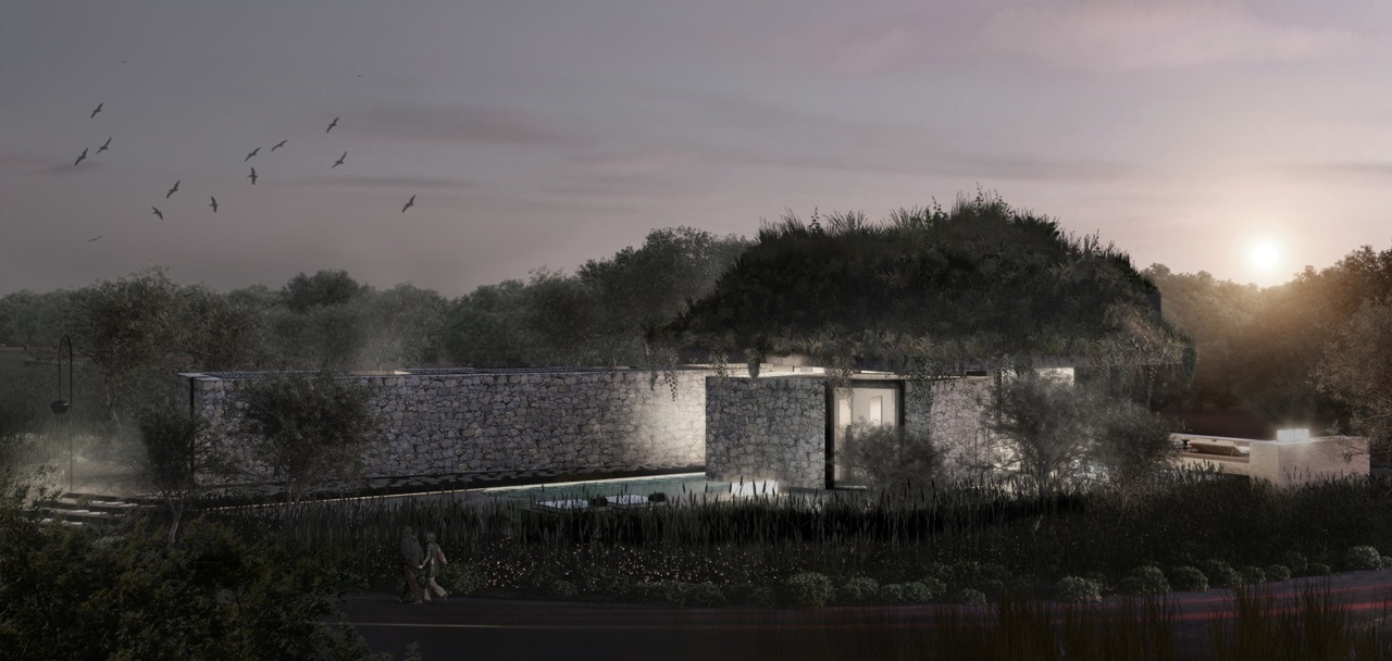
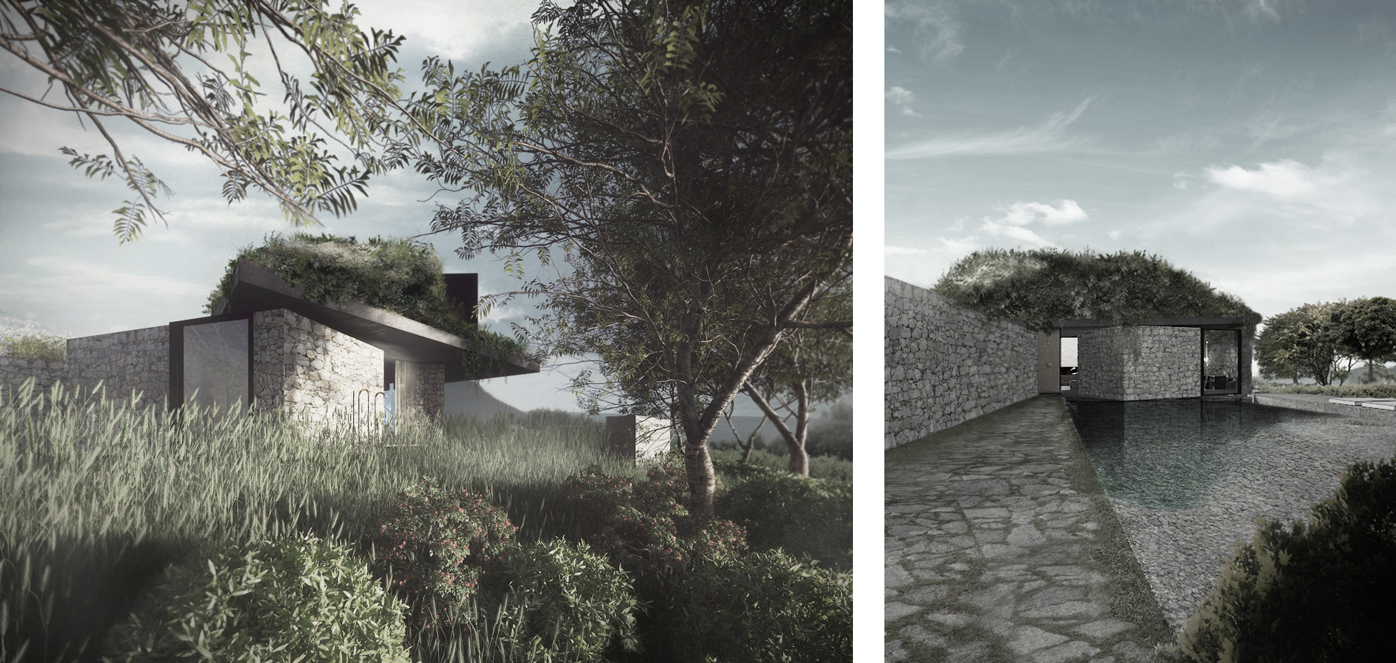
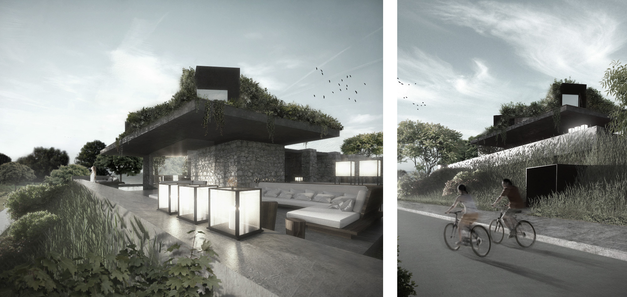
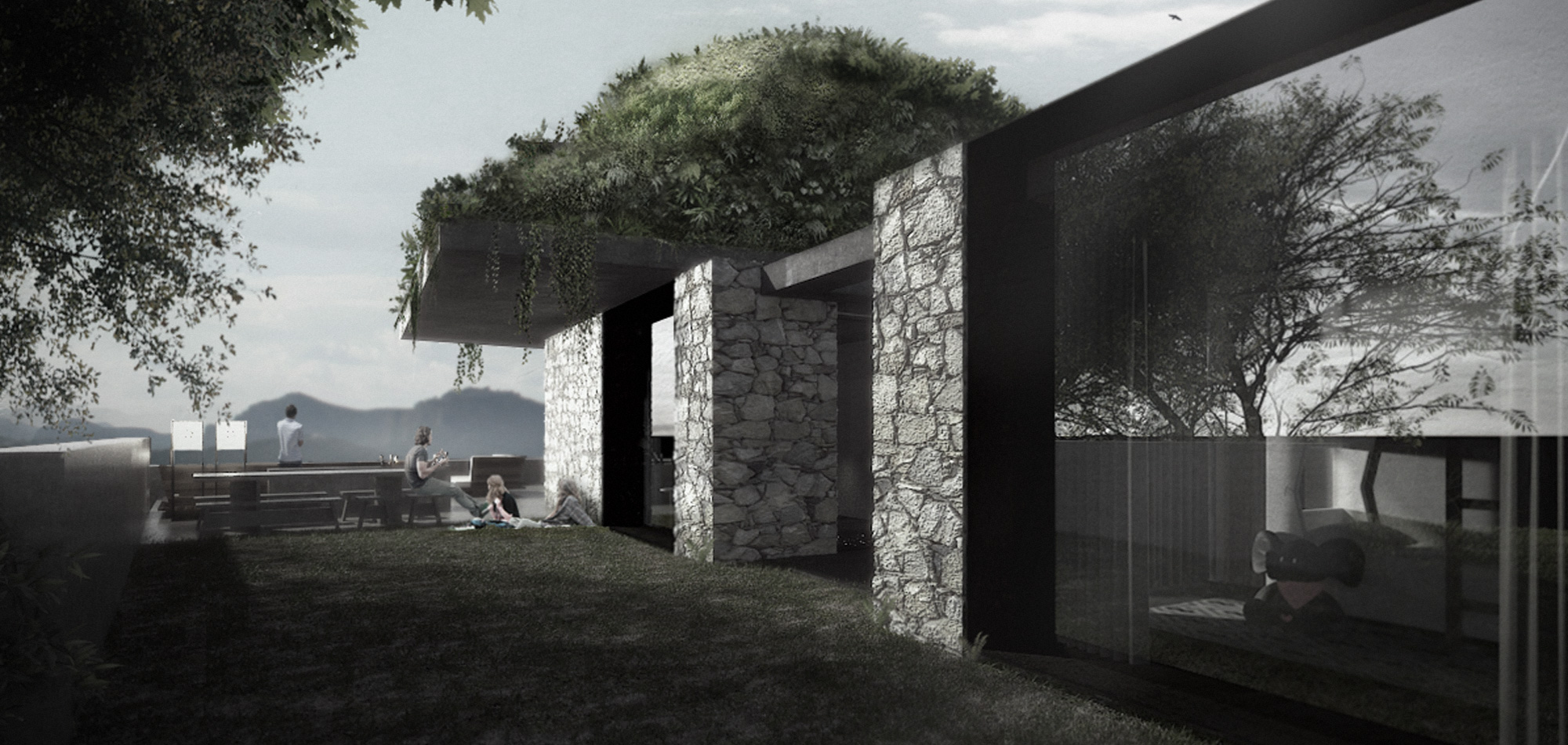
We created an architectural composition with the characteristics of cinematic montage, an implicit flux of form. The cinematic analogy lies on the fact that a spectator follows an imaginary line among a series of objects through the site as well as in the mind. Approaching the site from the main entrance, the impact of this cinematic planning concept is evident everywhere. The mimesis concept becomes instantly apparent, as the rooftop containing the master bedroom, covered in live growing fauna, blends with the surrounding vegetation. Its trapezoid form and its gentle slopes give the appearance of a plant covered tent and diminish its volumetric impact.
We were inspired by the simplistic function of the first photographic apparatus, “camera obscura”, which in Latin stands for “dark chamber”. The device consists of a box or room with a hole in one side. Light from an external source passes through the hole to strike a surface inside, where it is reproduced and inverted (thus upside-down), but with color and perspective preserved. The image can be projected onto paper, and can then be traced to produce a highly accurate representation. This optical inversion provided inspiration for our architectural inversion of detaching the ‘garden’ from the ground.
Camouflage is generally achieved through intentional manipulation of reality. The result here is dissolution rather than dilution. It is a tactical dissolution of the object based upon the blurring of its silhouette and the dissolution of its former solemn form and present. This move strategically, is not a tendency to passive invisibility, rather than a transmutation ultimately aimed at responding to concrete local demands through ambiguous mechanism of fusion and transfusion. In this sense, camouflage becomes a tactical mechanism based on the principles of erasure. This project deals with the oscillation of what is natural and what is constructed and attempts to establish a dialogue between ‘naturalization phenomena and the separation processes of its naturalization’. The open air area on the southern side and the encased fenestration, act as devices which frame uninterrupted views of the landscape.
MIMESIS IN ARCHITECTURE
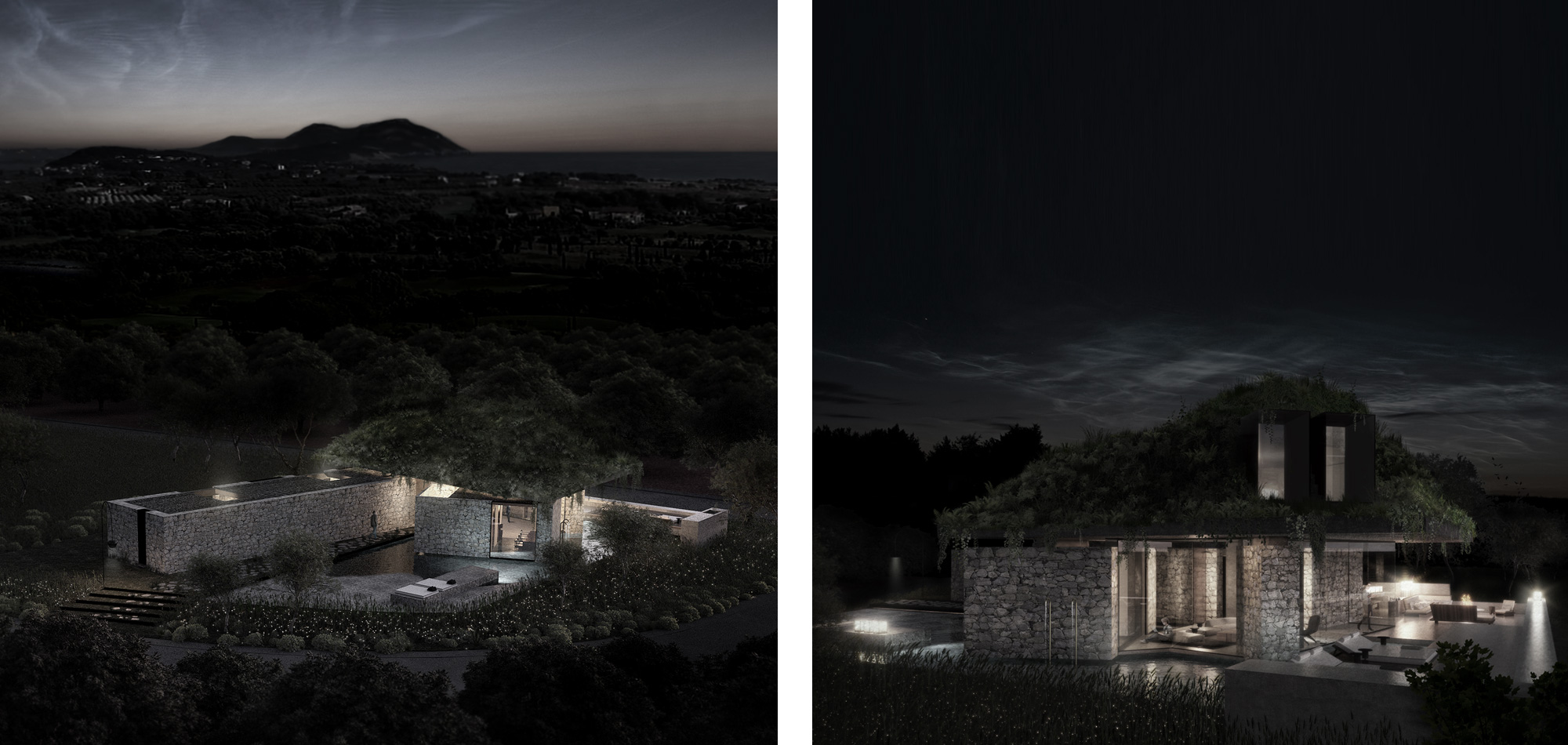
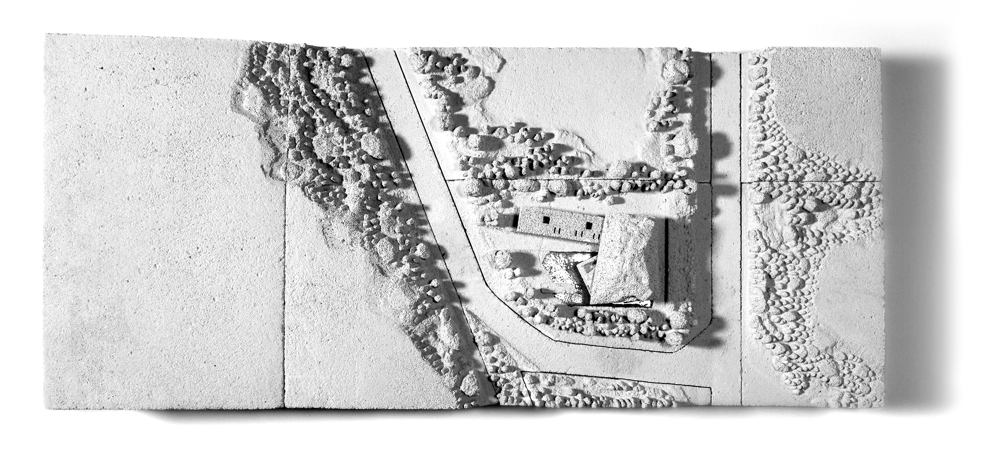
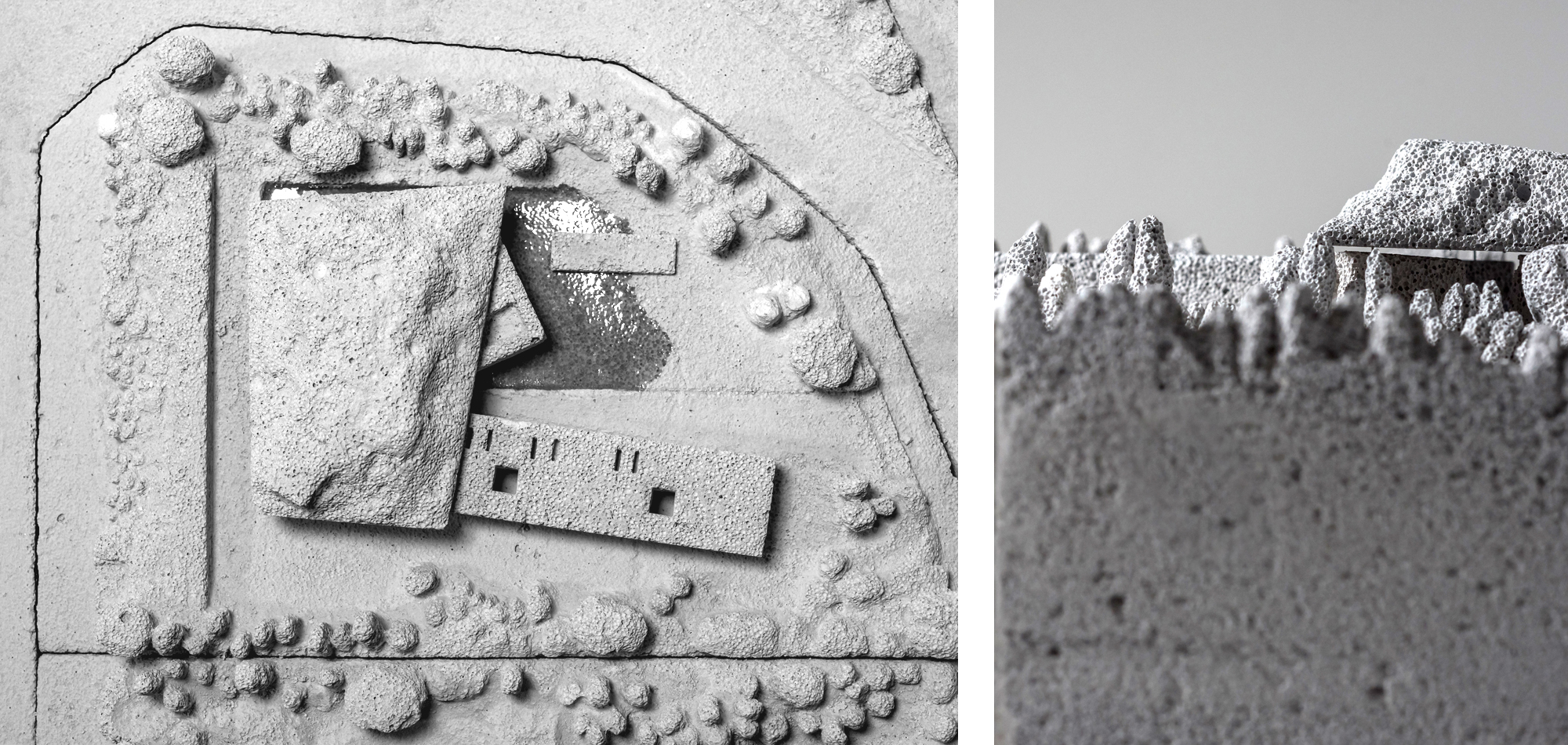
Mimesis seems to reduce the informative charge in the landscape. The roof top exhibits a mimesis of skin and color drawing certain biological affiliations. But the mimetic effect does not stop in the green roof. The mimetic concept involves the selection of materials and techniques and the development of the volumetric solution to match the morphologic horizontality and the colors of the landscape. The programmatic organization is articulated in three above ground volumes and two underground areas. On entry level there is the sleeping zone and visitor’s compartments encased within the 50cm thick stone walls of the longest building volume. The narrower stone clad volume contains the kitchen area with its protected atrium.
CAMOUFLAGE AND PROGRAM
The two stone volumes are arranged at a certain angle such as to produce an exaggerated perspective effect. Their considerable mass and scale given by their materiality is a characteristic of the timeless example of the local vernacular architecture. The kitchen volume floats 10 cm above water seeming weightless contrasting the effect of the longer volume which appears to be anchored in the earth. The water produces rippling reflections of the narrow volume exaggerating its appearance and counter- balances the synthesis. In the southern side in front of the two stone volumes is the living space which also floats above water and is completed covered in glass.
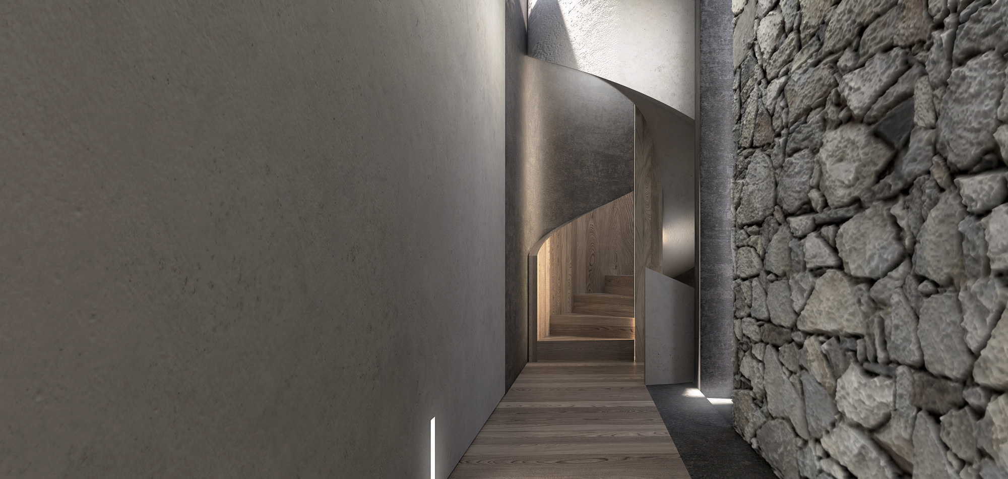
The living area offers an uninterrupted view of the pool area and the landscape extending to the sea. The transparency of the glass counter balances the considerable mass given to the other volumes. Through a spiral staircase in the living area access is provided to the top green crowning. The plants used to cover the structure of the tent like volume are indigenous and require minimum maintenance. The necessary techniques used were borrowed from military and survivalist manuals. The goal was to blur the silhouette with the surrounding and diminish the volumetric impact to the visual field. The top volume seems to float above the stone volumes like a green cloud. The inspiration of this approach came from the view of the green covered island which can be seen from the site.
There is one underground volume that follows the footprint of the underground floor and contains parking and auxiliary rooms. Our goal was to create order and drama using architectural and cinematographical techniques, like the montage. In plan the forms appear free and arbitrary at first inspection, but moving around the site, order is composed through the orchestrated appearance of the building mass on the viewing plane and recomposed every time, by the change of the observation angle and the viewer’s proximity to the subject. As the Greek architect A. Konstantinidis has mentioned, life in Greece takes place in the outside. Having in mind that important quote we did not want just to provide a picturesque summer house, but a calculated setting for the perfect summer living.
The structures, materials, surfaces and textures of the overall environment of Pylos left a very strong impression on us. Ancient and modern, joined in the same habitat and all surrounded by the exuberant vegetation. Structures do not overpower nature, but rather co-exist with it in equilibrium. That delicate balance is what we aimed for by designing a residence in balance with its Topos .
We considered various techniques and methods of approach from art, cinematic survival techniques and archeological and architectural theories. All to incorporate and capture that feeling of Pylos where one transcends through layers of nature, memory and history. That sincere feeling can only be experienced, in our opinion, when architecture manifests itself gently and considerately rather than in an imposing and over powering way.

